Typography Zine
Challenge
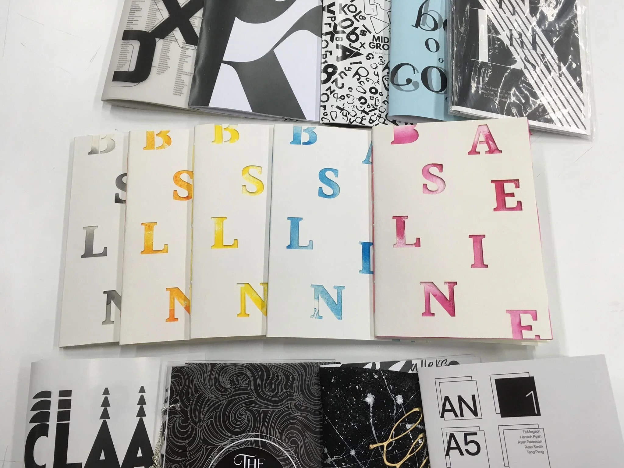
This was a group project for the subject of Typography. The brief was to create a typography zine with no illustrations, only type. No colour was to be used except on the zine cover. Each group member of four created two spreads each.
Outcome
I created a typographer profile on Alex Trochut. My other spread was a font review of student work, “Edenglassie”. These spreads can be seen below. I also helped with the cover design.
Scope
We printed, bound and exhibited our A4 sized zine for the end of semester exhibition.
Reflection
I found this group project enjoyable and rewarding. I discovered a love for layout design. It was a fun challenge to balance the larger text elements with the body copy. Our group chose to incorporate smaller page layout elements to establish a consistent visual language of the zine. I enjoyed working in a creative team and look forward to doing so in the future.


