Vincents Rebrand
Challenge
Vincents is an established professional services company in Australia that has been running for over 35 years. Their services include accounting, auditing, restructuring and recovery, lending, forensic and litigation, advisory and wealth management.
The goal of the rebrand was to update this long-established company, bringing it into the modern era. The identity design had to be easily expanded upon as the company grows. View their website at vincents.com.au.
Outcome
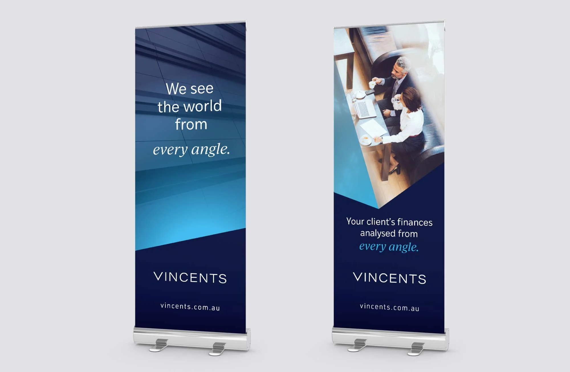
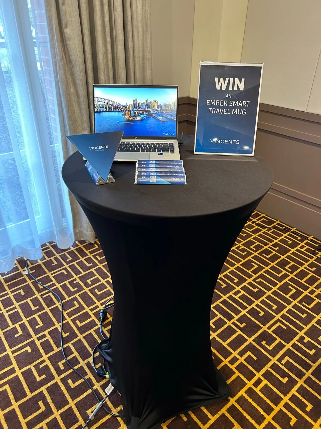
The finished outcome was an identity design that was then moudled into marketing material such as the website, signage, brochures, promotional gift, media walls, reports, powerpoints ect. The set can be easily expanded upon as the range grows.
Logo Free Space
To ensure legibility, the minimum print size is 30mm, digital size is 120px.
The amount of free space around the logo and sub-brand wordmarks must be a minimum distance of ‘X’ on all sides. ‘X’ is based on the height of the wordmark.
Colour Palette
The three primary blues and their tints are to be used for the majority of the marketing collateral. The secondary oranges are to be used to draw attention to a specific piece of information.
Learn more about me and what I can do for you here.
Or view other projects from the list below:


